Select Layouts
At this time, there are two available step layouts for the single-select and multi-select select step types. The "cards" and "list" layouts.
Using the layout property available on single-select and multi-select step types allows you to change the select experience from cards to list.
We recommend choosing the layout you'll go with based on the number of selectable item answers. If you have many selectable answer options, opt for the list layout over the cards layout to make it faster for users to scroll through many selectable options.
If the layout property isn't provided, the app will default to the cards layout with two cards per slide.
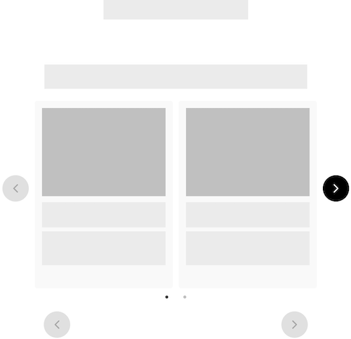
Cards
The cards layout is a collection of selectable surfaces. They make it effortless to quickly identify relevant actions. Cards can contain several elements such as images, titles, and descriptions. The cards layout uses a swipeable carousel to navigate the selection options, providing a streamlined experience on any screen or embed size.
{
  "name_of_step": {
    "type": "multi-select",
    "layout": "cards",
    "style": "classic",
    "title": "",
    "dialogue_title": "",
    "dialogue_title": "",
    "cards_to_show": 2,
    "cards_to_scroll": 1,
    "items": []
  }
}
Config Options
Cards that are displayed in a carousel have a few configuration options including cards_to_scroll and cards_to_show.
{
  "name_of_step": {
    "type": "multi-select",
    "layout": "cards",
    "style": "classic",
    "title": "",
    "dialogue_title": "",
    "dialogue_title": "",
    "cards_to_show": 2,
    "cards_to_scroll": 1,
    "items": []
  }
}
Full Example
{
  "settings_version": "1.0.3",
  "embed_height": {
    "desktop": "550px",
    "tablet": "520px",
    "mobile": "520px"
  },
  "account_id": 12821,
  "enable_link_check": true,
  "stripe_public_key": "",
  "steps": {
    "looking_for_classic": {
      "title": "",
      "dialogue_title": "",
      "dialogue_title": "",
      "type": "single-select",
      "layout": "cards",
      "cards_to_show": 2,
      "cards_to_scroll": 1,
      "style": "classic",
      "items": [
        {
          "title": "",
          "description": "",
          "value": "Product"
        },
        {
          "title": "",
          "description": "",
          "value": "Product Two"
        }
      ]
    }
  }
}
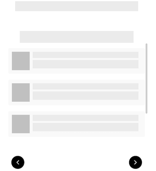
List
Lists are a great option when you have a longer list of selectable options. We recommend choosing a list layout over a card layout when you have many selectable options - anything greater than six options.
{
  "name_of_step": {
    "type": "multi-select",
    "layout": "list",
    "style": "classic",
    "title": "",
    "dialogue_title": "",
    "dialogue_title": "",
    "items": []
  }
}
Full Example
{
  "settings_version": "1.0.3",
  "embed_height": {
    "desktop": "550px",
    "tablet": "520px",
    "mobile": "520px"
  },
  "account_id": 12821,
  "enable_link_check": true,
  "stripe_public_key": "",
  "steps": {
    "looking_for_classic": {
      "title": "",
      "dialogue_title": "",
      "dialogue_title": "",
      "type": "multi-select",
      "layout": "list",
      "style": "classic",
      "items": [
        {
          "title": "",
          "description": "",
          "value": "Product"
        },
        {
          "title": "",
          "description": "",
          "value": "Product Two"
        }
      ]
    }
  }
}